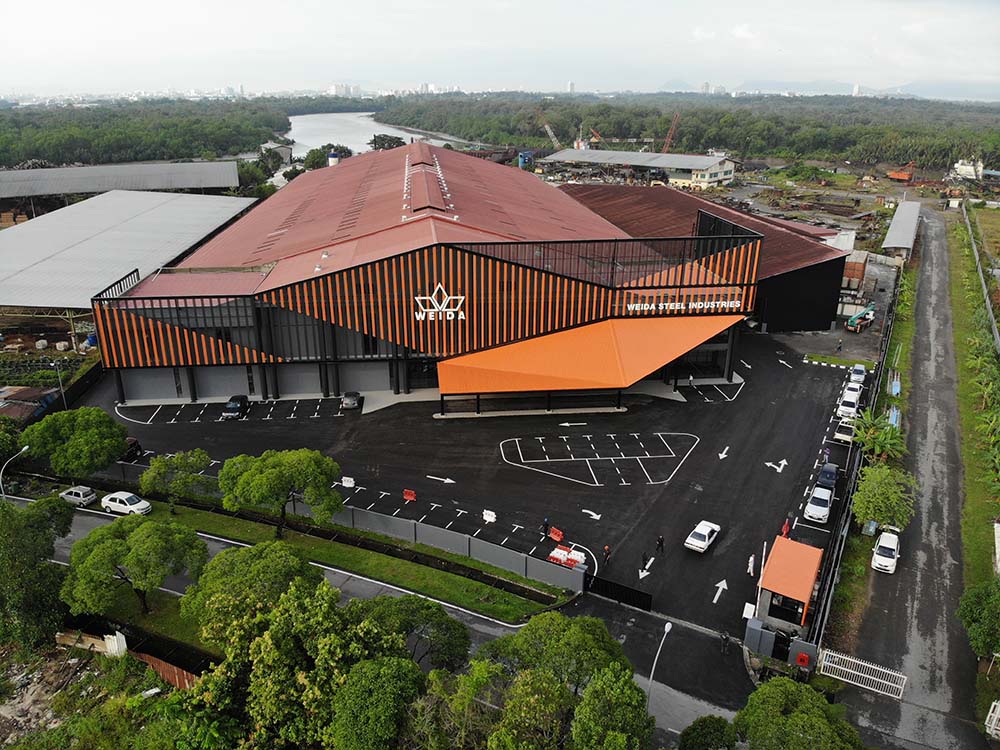
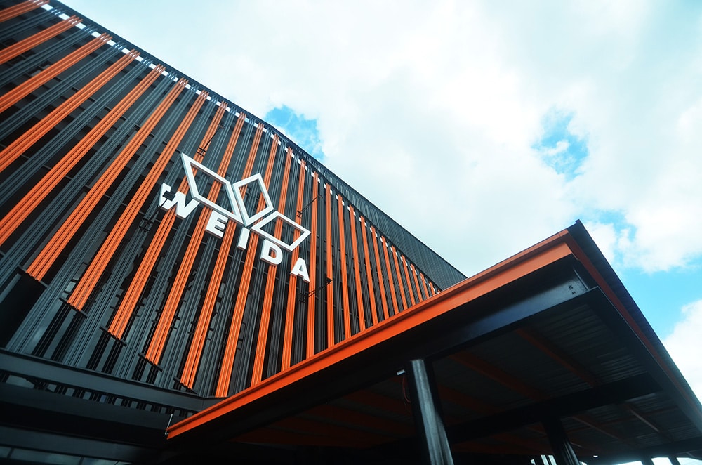
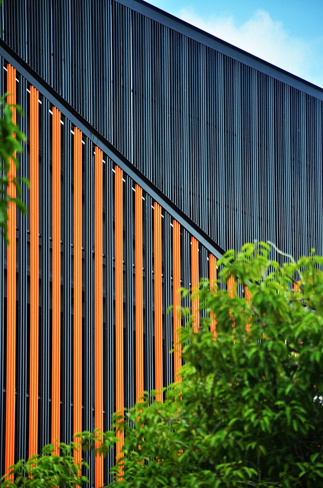
Located within an industrial zone, the newly renovated factory owned by Weida Steel Industries stands out vividly as a landmark from afar within its humble and quiet industrial surroundings. Refurbished to include a lively colour scheme and contemporary screen envelope composition, the newly refreshed building design is meant to enliven the streetscape and form an industrial context to its surroundings.
The client's brief was to revamp the abandoned furniture factory with a white classical facade into a modern showroom cum office for a steel manufacturing business. (It was a facade-orientated design.)(remove) The intention was to renovate the front facade of the existing factory for a contemporary identity facing the main road. It would create a fresher look to the surroundings, and to create a new branding identity for an enhanced corporate image.
The layout is basic with minor alterations. The three-story office block at the front has a ground floor consisting of a lobby, products gallery, meeting rooms, office, storage and amenities. The upper floors consist of more office spaces and a conference room. Behind the main office, the block is the steel manufacturing area.
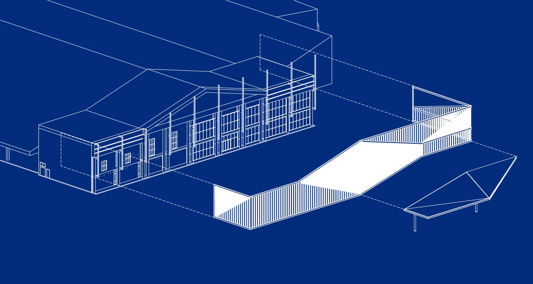
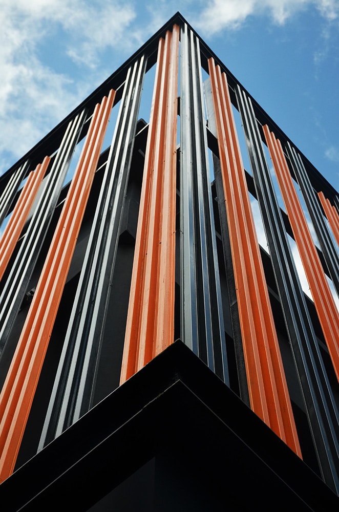
The original facade was symmetrical, with classical ornamented expression. Our design strategy was to break down its symmetrical and solid expression by introducing a screen facade that envelopes the factory. Although screen envelopes are nothing new, when incorporated appropriately onto a building, it can offer radical responses to contemporary design strategy. The screen envelope is designed to be more than being decorative. It is also functional, providing privacy, ventilation, and filtered daylight. It also serves to connect between inside and out.
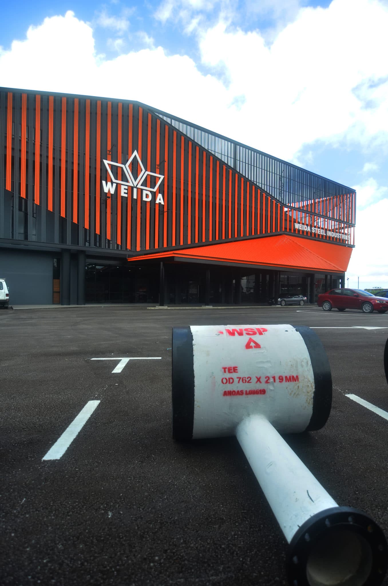
The pattern on the new screen envelope oscillates between organic and geometric design. More significantly, it is light and contemporary, in contrast to the previous heavy classical image. During construction, most of the walls were replaced with large glass panels to bring in daylight and create transparency. The existing building is muted with a darker tone to become the ‘backdrop’ to the new screen envelope.
Apart from the consideration of material availability, time and cost-effectiveness, the facade envelope was also intentionally designed and detailed to showcase the client's steel business. The design involved innovative use of the standard industrial components with creative detailings.
The design of the screen facade is influenced by geometrical patterns adopted from the business corporate logo. The two-dimensional logo was transformed into a three-dimensional screen envelope through the anatomy of facade components that were placed in layers to create a distinctive look.
The repetition of geometry and its composition – stretching, folding, and peeling to reveal the programmes behind the screen – define the entrance as well as improve the spatial experience, mediating the relationship between the inside and outside. With this design methodology, the screen envelope takes on different roles and enhances the scenographic experience, where the building facade is ‘animated’ with movement along the main road.
